As deadlines are quickly approaching in our Fashion and Identity course, my classmates and I have been working on perfecting our project websites. This week, I viewed my colleagues’ websites once more, and I must say, I am really impressed. Everyone’s websites are looking pretty good so far. In a post two weeks ago I looked over Montevallo’s and MSU’s website, but two other sites that stood out to me are the ones from UMW and USAO.
Abigail and Corey from UMW focused their website on the fashions of the eighties. I loved how their bright, multi-colored header image contrasts and flows with the simplicity of the black and white found throughout the site. This totally reminded me of patterns from the nineteen-eighties! The top menu is also nice and simple, leading the viewer to the most important topics on the decades fashion. I like that the website displays both national and local fashion trends of the decade, as well. Something I learned from my project was just how different local fashions are from the popular “trend.” The UMW website also seems to come to the same conclusion. Another piece I think works really well within the website are the timelines. These run smoothly with nice images, context, and a great breaking down of the fashions within the text that followed. I would like to see even more iconic events for each timeline. Overall, the website was easy to navigate, fun, and informative. The one thing I was momentarily confused by was when I clicked on both the men’s and women’s fashion trends pages. I was expecting to have an option to go to the national and local trends pages from the introduction pages without having to go back to the dropdown menu. While I really do not feel like it is necessary to link the national and local trends pages to the introduction pages, I think it would be a nice touch to add in order to direct the viewer where you want him/her to go.
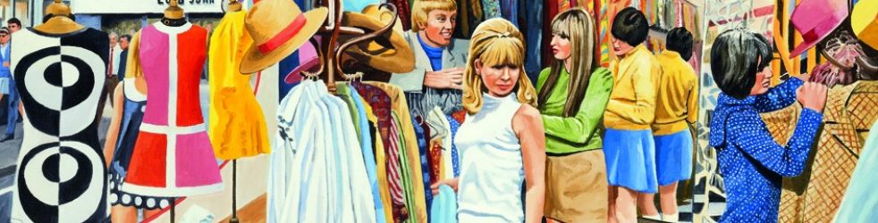
The second website I viewed this week was created by Will and Kyra from USAO. Their website focuses on space-age fashion in the nineteen-sixties. I found the topic they chose for the project really intriguing partly because I am living for sixties fashions right now, and also because space-age fashions were so unique and like nothing anyone had seen at the time. I think the futuristic fashions of the sixties helped to promote creativity and art in the fashion industry. Fashion was no longer about what was logical or realistic to wear but about making an artistic statement. Something that I loved about the website was the choice of images and the narration found throughout. Both of these elements made it a joy to navigate the website. Something I had trouble with was deciding which pages I should look at first. Is there an order to how the site should be looked at? The pages on science and space exploration were fun and help to give the audience some background information, but I would love to see more about the fashions themselves once the site is complete.
Ambar: Good insights/comments. I agree with your evaluations. I hope you are able to transfer some of your thoughts into ideas regarding your own project? Dr. Brown