Tinkering

Good evening!

As I was looking at Kathryn and I’s website, I couldn’t help to ponder about possibilities. I am really digging the black and white aesthetic still. I feel this will stay for the final product. The black and white really sets the tone of our project: scoping the past. I could not imagine a better color duo for our research. I suppose we could do a primarily purple background as those are our school colors; however, our focus is on the content of our findings which is purely historical. Hence,  black and white works best to parallel our research.

Our header

I would like our subheadings to the decade’s information to be a bit more dominant in the website as that is our primary focus. We want to focus on content. The only dominant thing on our page is the picture which is fine, but I feel we need to reassert our focus. I will tinker with that idea soon for finalization.

I also need to make the Pre-1950’s history tab to be at the beginning, before the 1950’s rather than at the end. I feel it fits best in numerical order since we are focussing on the evolution of the decades.

Other than those two revisions, I feel we are on the road to success!

Carley W
Reflecting on Project

Good morning!

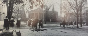
Overall, I am very pleased with how Kathryn and I’s project site looks. I love our header picture as it is a black and white image from the 50’s, I believe. It reveals men and women walking to class in their attire fit for the decade. It is so funny to see since I walk that same route depicted in the image, but I see hoodies and sweatpants instead of dresses and scarves. This image represents our entire site and goal which is to see how Truman’s dress code has evolved.

Secondly, I am pleased with our links to different pages on the blog. Each is a decade in which makes it super easy for the reader to dive in our content. I wish there was a way that the links could go underneath the header that way the links are very central rather than at the top where they might be missed.

I also like our black and white vibe on the site. The color scheme allows for the viewer to understand that this project is based on the past. It also allows for the content to be in the spotlight as this will be colorful and differentiated from the black and white scheme. There is a violet accent color occasionally on links as it represents Truman’s color.

Overall, I am very content with our project site. We will probably do a little tweaking here and there, but I feel we have an organized, aesthetic, and representational site in which will benefit the audience.

Till next time!

Creeping on Project Sites

Good evening!

I have finally gotten around to visit my classmates’ project sites. The project sites in particular that I will be commenting on are MSU Texas and 1960’s Fashion in Southwest Virginia. Both of these websites were very well done.

I really enjoyed how MSU Texas’ project site was organized aesthetically and categorically. The stark white background with black lining makes for a very clear and concise website. It emphasizes the content in which they choose to show in their blog posts. For example, their first project blog post included a very colorful and 90’s picture. By the background being very simple, it allowed the picture in the post to POP!

In the project site for fashion in the 1960’s from Southwest Virginia, it is very different from MSU Texas’ theme, yet it still works very well for the content and theme. The background includes a very sixties pattern, and the header showcases a girl from the sixties against a very stylized background. Both of these images from their site explores the popularity of patterns and totally embodies the busyness of the sixties culture. Well done!

I also thoroughly enjoyed each of the project pages’ use of subcategories and different sections. Though, there is not any content yet, I find this to be very useful to navigate.

Great job, classmates!

Image result for meme clapping

Blog Post 6: Group Site Appearance

Good morning! Happy Spring Break to us from Truman State!

In terms of Kathryn and I’s group site, we have much to do! Not necessarily because it looks bad, but we definitely can amp it up with some fun images relating to our group project goal.

I think our header could have an image and caption that we will scan from Special Collections. Maybe this one?

I feel that a witty header would set the tone for our feminist rants and reflections on all the sexist remarks regarding dress code and women, in general, in these Truman documents.

We also could probably change up the theme to be a little more exciting. If we wanted to focus more on images like thumbnails for our posts, I have a layout in mind.

We even could set our blog up with automatic music when people are reading our blogs on our page? Maybe a new one for each decade? Or maybe just fun feminist songs that are women empowered. Possibly.

Much to think. Much to tinker. All of it is fun!


Till next time!

Blog Post 5

Good afternoon!

I plan on using lots of images on this blog post as well at Kathryn and I’s shared group page for the project. Since our project is so focussed on the evolution of expectations for dress (parties, going to classes, etc), we have been looking through Truman State’s handbooks which are fairly visual as well as yearbooks from the past. This yearbook has stopped production after 2007.

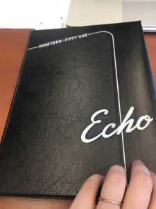
Kathryn and I both have been thrilled with looking through these yearbooks in Special Collections. I mean look at this one from the 50’s!

I mean, how much more fifties can it get?

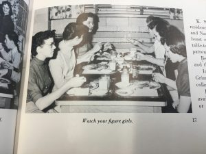
However, we have stumbled on the large bouts of sexism that is seen in captions of photos in these yearbooks. I have numerous pictures of this evidence, but I have attached one of the photos that led me to cringe.

“Watch your figure girls.”

On a positive note, I am so happy that Truman is no longer like this sexism depicted in the photo’s caption. Our campus is very progressive and liberal in nature; for that, I am so glad. Yay equality!

Till next time!


Blog Post #3

Good evening!

I wanted to try out a few of the different widget and fancy gadget tools. In my future blog posts, I want to include various types of tools for getting my ideas out there such as images, videos, audio, etc. This blog post will explore these methods as well as my research topic.

Kathryn and I will be doing our research project on Truman State University’s evolving expectations for dress. We will be focussing on the 1950’s and in through the present time. However, we will also be discussing a bit of pre-1950’s as well since it helps shape the decade’s expectations. I am very interested to see the different expectations of men and women as this college used to primarily be for students wanting to be teachers.

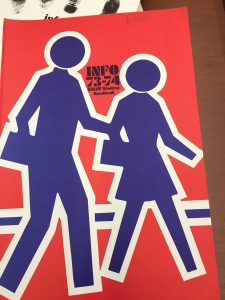
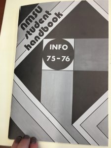
Kathryn and I spent this past week reading through Truman State University’s past student handbooks. Honestly, it was a thrill. Going through handbooks from the early 1900’s and in through the present. Each decade had such stylistic covers, each cover was a piece of history. Personally, I loved the graphic design on the covers of 1970’s handbooks.

Below, you will see some examples.

It was so entertaining to view pictures from alumni within these handbooks walking around campus. Our campus is fairly small, so Kathryn and I could recognize where these individuals were. Many of the women and men wore flared jeans, graphic tee shirts, high waisted shorts, etc. The 70’s are my favorite decade. To me, the fashion, design, music, art, everything incredibly important to my life is within the decade.

To end this blog post, I thought I would add an audio clip of a couple of my favorite songs from the 70’s as a teaser for Kathryn and I’s research. This will assist me in the future when I add interview audio clips for research.

Till next time!


Blog Post #2

Hello there! I thought I would dress up my blog site of colors and images that inspire me.  I feel I am at a solid start for the look I want to achieve in this blog center.I thought I would address these changes as they are fairly subtle.

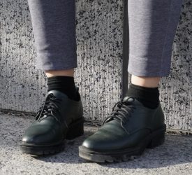
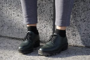
My first change was displaying a picture that represents my blog. This picture being a photo of my favorite shoes against this interesting wall in SoHo, New York. The wall displayed graffiti and pop art, and it stared at the body of water glimmering across the street.

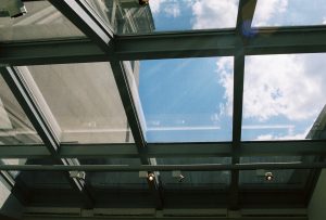
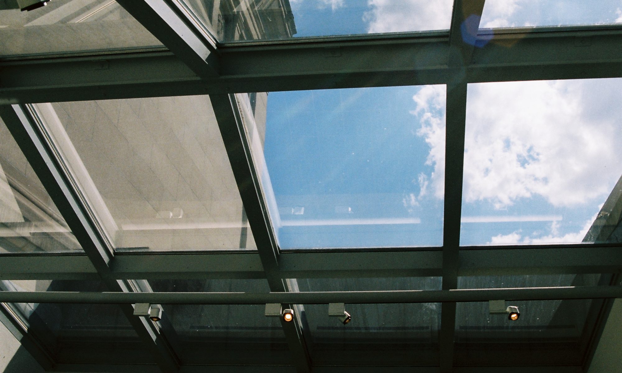
The second change I made to this site is the background. I chose a picture I took using my Pentax K1000 in my favorite gallery space at the Saint Louis Art Museum. This room holds Asian ceramics within glass cases. There’s a convenient bench at the edge of the room. If you sit in it, you can admire the entirety of the glass windowed ceiling. Every time I go to SLAM, I visit this room as it sparks my creativity. I felt it suited this blog site.

The third and final change I made was the coloring of my headers in which I made a light yellow. This is simply because the color symbolizes light and nature. I felt the color added light and brightness to my site.

Until next time!

Hello world!

This is my first blog post, so I will do a little introduction as well as a fulfillment of the actual assignment for this post. I am a sophomore Art History student at Truman State University. I want to go into museum studies; however, I have a plethora of passions such as fashion. Kathryn and I will be working together for the duration of the semester to create our final project.

Kathryn and I are intrigued in how dress code has evolved within our University. Our University started off as a school to learn to be a teacher. It was known for being a teachers college. In 1985, the institution decided to expand the school to be the holistic education it is today being a liberal arts college that extends statewide. Due to this knowledge, Kathryn and I want to use our school’s archives to find student handbooks, Truman publications, and other articles written on the dress code. We have asked our Special Collections if they have these items, and we are in luck.


Kathryn and I expect that there are more women-centered dress code documents rather than centering men. We are excited to find out if the university has changed in their expectations over the years.


Till then