Good morning!
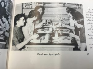
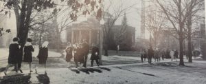
Overall, I am very pleased with how Kathryn and I’s project site looks. I love our header picture as it is a black and white image from the 50’s, I believe. It reveals men and women walking to class in their attire fit for the decade. It is so funny to see since I walk that same route depicted in the image, but I see hoodies and sweatpants instead of dresses and scarves. This image represents our entire site and goal which is to see how Truman’s dress code has evolved.
Secondly, I am pleased with our links to different pages on the blog. Each is a decade in which makes it super easy for the reader to dive in our content. I wish there was a way that the links could go underneath the header that way the links are very central rather than at the top where they might be missed.
I also like our black and white vibe on the site. The color scheme allows for the viewer to understand that this project is based on the past. It also allows for the content to be in the spotlight as this will be colorful and differentiated from the black and white scheme. There is a violet accent color occasionally on links as it represents Truman’s color.
Overall, I am very content with our project site. We will probably do a little tweaking here and there, but I feel we have an organized, aesthetic, and representational site in which will benefit the audience.
Till next time!